Now, after consulted by Madam Lydia,
I would like to change the size of my e-wallpaper and re-changed my e-wallpaper.
Let's start!
 |
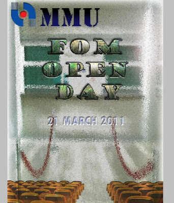
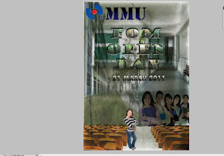
| This is my previous E-wallpaper. |
so, I redo it again but I'm also still using some of my previous e-wallpaper pictures
and others.
So, it will reduce my time to do it again on the same things.
So, it will reduce my time to do it again on the same things.
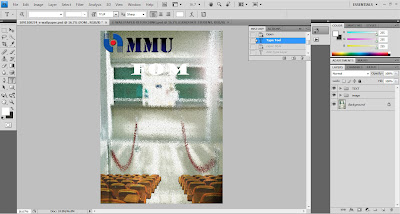
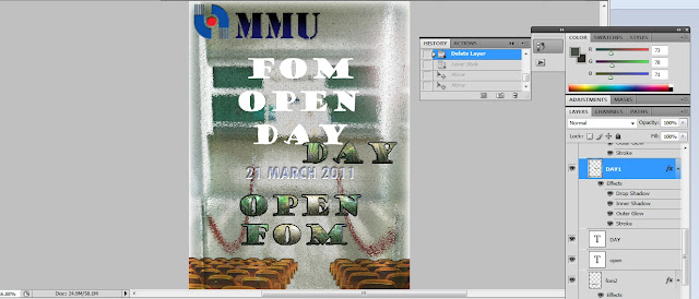
2nd- Then, I moved in the MMU LOGO and MMU WORDS by using Move Tool.
3rd - I've placed it on the upper side as same as how i had placed on my previous e-wallpaper.
5th - I've moved the chair from my previous e-wallpaper and placed it like this as shown above.
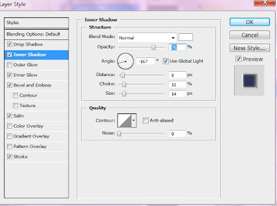
"Inner Shadow" > changed the opacity to 75
"Inner Glow" > changed the opacity 75%

9th - I've moved the "OPEN" words that I've had edited
by using Advanced Layering Method
which has shown on my previous post.
http://joan-digitalmedia.blogspot.com/2011/07/a1-advance-layering-my-e-wallpaper.html

11th - I applied again on the 3 layers words.
"Layer Style" > "Drop Shadow" , "Inner Shadow" , "Outer Glow" and "Stroke"
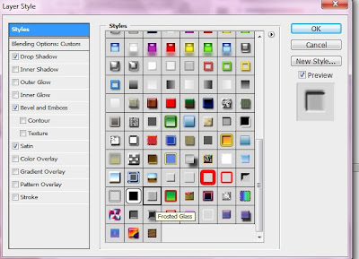
12th - Then, I've chosen "Frosted Glass" style on the WHITE FOM OPEN DAY words.
Style > "Frosted Glass"
and I've applied this :
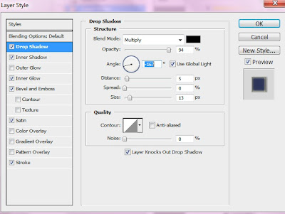
- "Drop Shadow"
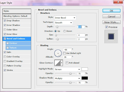
- "Bevel and Emboss"
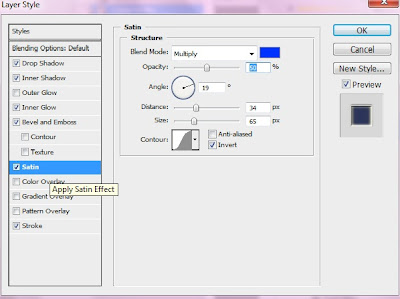
- "Satin"
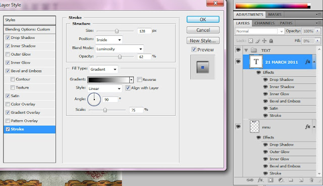
14th - I felt that the date (21 March 2011) words was not sharp .
So, I've applied :
"Drop Shadow"
" Inner Shadow"
" Inner Glow "
"Bevel and Emboss"
- "Satin"
"Gradient Overlay"
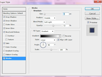
" Stroke "
and then applied "Gaussian Blur" effect too.
"Filter" > "Blur" > "Gaussian Blur"
"Filter" > "Blur" > "Gaussian Blur"
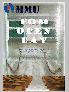
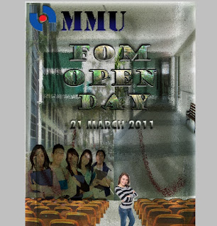
Hence, it became like this.
^_^

15th - I've moved the 2 FOM building pictures from my previous e-wallpaper to latest(now) e-wallpaper
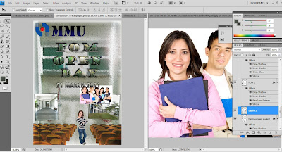
16th - I decided to put this "happy women student" pictures into my e-wallpaper.
I selected it by using the "Quick Selection Tool"
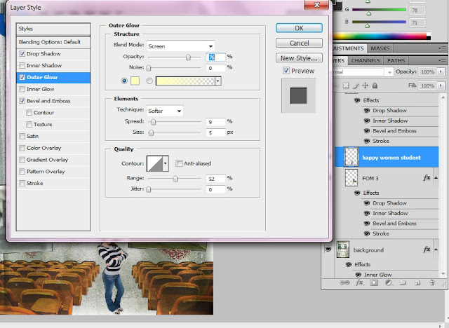
18th - I applied effect on the "happy women student" layer
"Layer style" > tick " Drop Shadow" , "Outer Glow" , "Bevel and Emboss"
Then, I placed the "Many Students " layer on the left side.
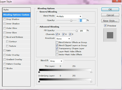
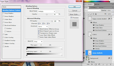
This is what I've applied for 1 of the FOM picture
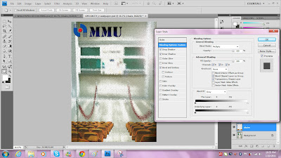
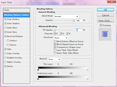
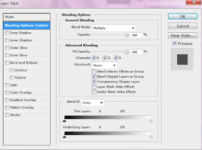
under "General Blending" > "Blend Mode = Multiply " > "Opacity = 72"
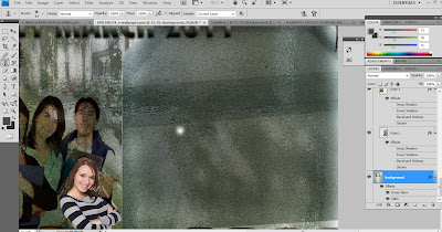
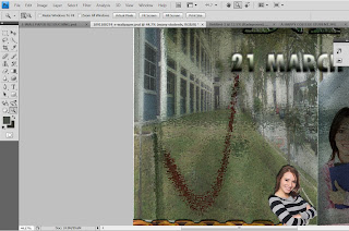
22th - I don't want to see the red colour rope here.
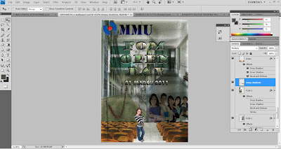
23th - I moved the "many students" layer aside so that I can retouch on the other side which haven't retouch.
Thus, this is the outcome after retouching.
So, I decided to add 3 birds on it.
25th - I've applied "Lens Flare" on the 3 birds.
"Filter" > "Render" > "Lens Flare" : Brightness = 73 , Movie Prime
"Filter" > "Render" > "Lens Flare" : Brightness = 73 , Movie Prime
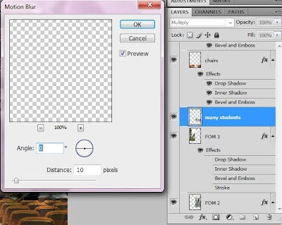
26th - I also have applied "Motion Blur" on the "Many Students " layer.
"Filter" > "Blur" > "Motion Blur"
Hence, it will became like the picture above.
29th - I applied some effect again on the date(21 March 2011) layer.
"Layer Style" > "Drop Shadow" , "Inner Shadow" , "Outer Glow= Structure = Opacity = 75 " ,
"Bevel and Emboss" , "Satin" , "Stroke"
"Layer Style" > "Drop Shadow" , "Inner Shadow" , "Outer Glow= Structure = Opacity = 75 " ,
"Bevel and Emboss" , "Satin" , "Stroke"
Therefore, it became like this!
30th - I found out that I've written wrongly the year.
It's suppose be 2012 and i wrote it 2011.
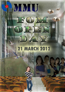
So, I added the actual date (21 March 2012)
So, I added the actual date (21 March 2012)
After that, right clicked on the one of the "date layer" as shown above.
then, choose "Convert to Smart Object"
❤
^_^


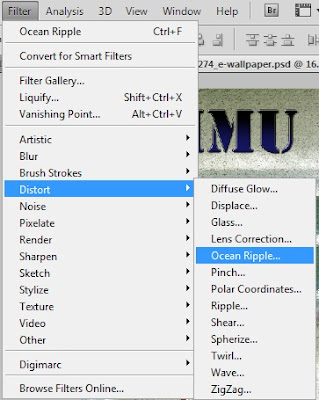










No comments:
Post a Comment